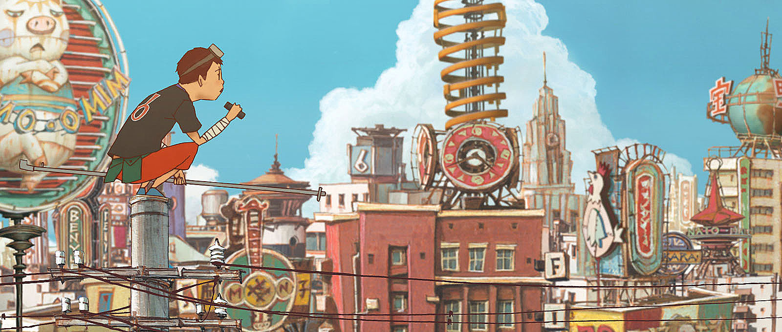
A really stylish blend of animation and live action directed by Christopher Alender from Soapbox Films and the composer Ben Lovett. I have to say the atmosphere and colour is amazing. It kind of reminds me of Sin City by Frank Miller because the creators only used green screen and computer graphics. The making of Eye of the Storm is also very inspiring. I wish there would be a full length movie of this, or something similar to this style. The music matched really well with the style, sort of a melancholy almost cinematic quality. Ben Lovett and Christopher Alender are definitely in one of my favourite artists list now.
EYE OF THE STORM | Lovett from Lovett on Vimeo.
The Making Of : Eye Of The Storm from Lovett on Vimeo.
Tuesday, October 11, 2011
Wednesday, September 14, 2011


Tuesday, September 13, 2011


Saturday, May 28, 2011
Glow
Isn't it frustrating when things don't turn out the way you thought it would be? Lighting and rendering really pisses me off. I wanted it to look like the night scene from "Theme Planet" by Michael Sormann:

Instead I get this:
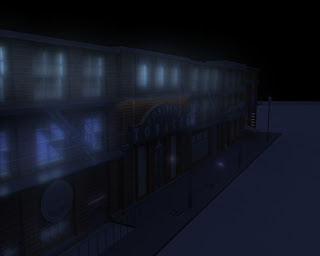
BLUE GLOW! Somehow the texture glow has become blue. Though it still kinda looks cool, somewhat like underwater city. Then I managed to fix it by placing ambient light among them, and here's the result:

Doesn't look bad, but It sucks compared to Michael Sormann's scene. I need more practice, but I suspect many post processing steps were taken to produce the exact result, and I've completely clueless as how to achieve that. If someone could shed some light it'd nice.
Thursday, May 26, 2011
Forget it Jake, it's noir....
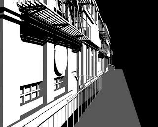
Yeah I've always been fan of the noir genre. Say Chinatown and Casablanca. Though some argue Casa is not exactly noir-like. It looks pretty noirish to me, the black and white visuals that is. I guess that makes Sin City a noir film. I like how Sin City combined live action and 3D to make an unique style. I'm in awe.
I've been trying to replicate that extreme silhouette look. So far it isn't bad, but I still think it lacks something. I'm guessing the model which I gotta be more detail about. Here's the image I made:

There's also another video that inspired me to try this silhouette look. That's Crystal Method + Matiyashu music video. It's just badass...


There's also another video that inspired me to try this silhouette look. That's Crystal Method + Matiyashu music video. It's just badass...
Tuesday, May 10, 2011
2.5D animations
Tweens do not make animations bad. It is the person doing it that is. The whole traditional 2d look is transformed into what people call as "2.5D" style. Usually backgrounds or complex objects are done in 3D while the characters are done in 2D using tween. The result is quite beautiful, it has its own charm compared to classic 2D. So computer animators don't be afraid to use tweens, but be sure to learn how to use it really well or it'll look like crap.
Animations that do this:
Notice all these awesomeness are from France. I really wanna go there now...
Animations that do this:
Notice all these awesomeness are from France. I really wanna go there now...
Friday, April 22, 2011
Drawing infos
Just a few reminders for myself concerning drawing tips.
Ron Lemen:
http://studio2ndstreet.com/tutorials/s2s_HeadDrwgChrctrDesign.pdf
Bridgeman's anatomy drawings:
http://www.archive.org/stream/constructiveanat00briduoft#page/209/mode/thumb
Recommended books:
Andrew Loomis
Burne Hogharth - dynamic drawing series
Deborah Rockman
James Gurney - Imaginative Realism
Lee and Buscema - How to draw comics the marvel way
Chelsea - Perspective for comic book artists
Vilppu - Drawing Manual
Subscribe to:
Posts (Atom)