A really stylish blend of animation and live action directed by Christopher Alender from Soapbox Films and the composer Ben Lovett. I have to say the atmosphere and colour is amazing. It kind of reminds me of Sin City by Frank Miller because the creators only used green screen and computer graphics. The making of Eye of the Storm is also very inspiring. I wish there would be a full length movie of this, or something similar to this style. The music matched really well with the style, sort of a melancholy almost cinematic quality. Ben Lovett and Christopher Alender are definitely in one of my favourite artists list now.
EYE OF THE STORM | Lovett from Lovett on Vimeo.
The Making Of : Eye Of The Storm from Lovett on Vimeo.
Tuesday, October 11, 2011
Wednesday, September 14, 2011


Tuesday, September 13, 2011


Saturday, May 28, 2011
Glow
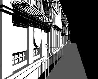
Isn't it frustrating when things don't turn out the way you thought it would be? Lighting and rendering really pisses me off. I wanted it to look like the night scene from "Theme Planet" by Michael Sormann:

Instead I get this:
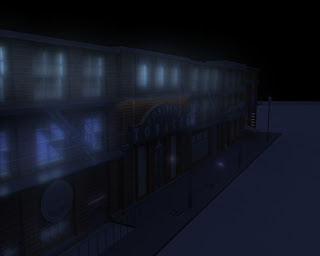
BLUE GLOW! Somehow the texture glow has become blue. Though it still kinda looks cool, somewhat like underwater city. Then I managed to fix it by placing ambient light among them, and here's the result:

Doesn't look bad, but It sucks compared to Michael Sormann's scene. I need more practice, but I suspect many post processing steps were taken to produce the exact result, and I've completely clueless as how to achieve that. If someone could shed some light it'd nice.
Thursday, May 26, 2011
Forget it Jake, it's noir....
Yeah I've always been fan of the noir genre. Say Chinatown and Casablanca. Though some argue Casa is not exactly noir-like. It looks pretty noirish to me, the black and white visuals that is. I guess that makes Sin City a noir film. I like how Sin City combined live action and 3D to make an unique style. I'm in awe.
I've been trying to replicate that extreme silhouette look. So far it isn't bad, but I still think it lacks something. I'm guessing the model which I gotta be more detail about. Here's the image I made:

There's also another video that inspired me to try this silhouette look. That's Crystal Method + Matiyashu music video. It's just badass...


There's also another video that inspired me to try this silhouette look. That's Crystal Method + Matiyashu music video. It's just badass...
Tuesday, May 10, 2011
2.5D animations
Tweens do not make animations bad. It is the person doing it that is. The whole traditional 2d look is transformed into what people call as "2.5D" style. Usually backgrounds or complex objects are done in 3D while the characters are done in 2D using tween. The result is quite beautiful, it has its own charm compared to classic 2D. So computer animators don't be afraid to use tweens, but be sure to learn how to use it really well or it'll look like crap.
Animations that do this:
Notice all these awesomeness are from France. I really wanna go there now...
Animations that do this:
Notice all these awesomeness are from France. I really wanna go there now...
Friday, April 22, 2011
Drawing infos
Just a few reminders for myself concerning drawing tips.
Ron Lemen:
http://studio2ndstreet.com/tutorials/s2s_HeadDrwgChrctrDesign.pdf
Bridgeman's anatomy drawings:
http://www.archive.org/stream/constructiveanat00briduoft#page/209/mode/thumb
Recommended books:
Andrew Loomis
Burne Hogharth - dynamic drawing series
Deborah Rockman
James Gurney - Imaginative Realism
Lee and Buscema - How to draw comics the marvel way
Chelsea - Perspective for comic book artists
Vilppu - Drawing Manual
Thursday, April 21, 2011
Some inspiring animations
It's been a busy week, with multiple assignments due before easter break... I'm surprised I'm still alive. Anyway, to revive the blog I'll put some outstanding animations for inspiration.
First one is of course, from my 2 favourite artists, Sylvain Chomet and Evgeni Tomov, titled "The Illusionist". I haven't watch the film yet, but just by watching the trailer I already love it. Hand-drawn oldies nostalgic feel, what's not to like?
Second is a Russian animation titled "Only for Dogs". Again I'm in love with the quirky characters and the color-pencil background. The story is just a simple life of a dog who goes to a club only for dogs. I found the mood very easygoing, plus the jazz music is good too.
Third one is a bit dark. The animation is again about dogs, but with a more realistic feel. Watercolor background gives a very melancholy feel, which is appropriate as the story is sad. Somehow I'm fascinated with the Russian language, the way they speak is depressingly romantic. It's quite long so it has to split into 2 parts
Sunday, April 10, 2011
Concept sketches
It's hard to decide between 2d and 3d. In 2d it's extremely hard to draw at extreme angles, while in 3d the camera can be positioned whenever I want. But in 2d I can create my personal visual style the way I want it.
Some concept sketches of the interior and the exterior:


Some concept sketches of the interior and the exterior:


Try listening to this while looking at the pictures http://www.youtube.com/watch?v=EokKk3xWZ-s
It really enhances the mood.
Friday, April 8, 2011
Change of concept
The story of current concept is uninteresting in my opinion. I'll change the concept to something more dark and gloomy. Not all life are the birds the bees and all that jazz I guess. Something more original, something more vague, something that nobody has ever done before, for final project. Then yes, I will have to change my previous concept about Damien and his life. The new concept features some crazy environments. All the things in the story is going to be symbolical, nothing is real.
The story:
It is about a character who lives in a small dinky industrial house high above the sky supported by steel structure. There is only a house and a long platform nothing else. Everyday, the character takes out a radio, walks to the end of the platform, and place the radio there, adjusting the tune. The radio then connected to a wire to generate electricity for the house.
Sometimes the weather will be bad, sometimes good. The electricity then fluctuates between on and off. Until one day, the character fall sleep on the couch and the weather is stormy. He got woken up by thunder and realizes the radio is still outside. With great difficulty he managed to get it back, but it has smashed into pieces by lightning. The scene then ends with him trying to repair the radio back and eventually working again.
The concept:
So the house in the middle of nowhere represents the character's inner worlds. The radio act as the communication between the character and the outer worlds, and they generate electricity to fulfil the character's social life. The weather symbolize the relationship status, whether it's good(sunny) or bad(stormy). When the radio is smashed, it expresses miscommunication that ends up with him being withdrawn into his own world sulking(no electricity). The ending conveys a message that it is always possible to patch things up between a relationship.
The style:
2d animation with sketchy style with some ambience music and a few still backgrounds.
Wednesday, March 30, 2011
background making
Right.... making background is super hard. But with practice and perseverance you'll prevail they said. I hope that's the case, I'm tired of drawing all those failed backgrounds. I made friends with some hand cramps too.
Anyway, it's tiring sure, but it's also quite fun. matching all those lines, colors, and characters together in a scene. One of my favourite concept artist is Evgeni Tomov, who created Les Triplettes de Belleville with Sylvain Chomet. If you haven't watch it, I strongly recommend you to. The animation has no dialogue aside from the grunts, laughs, and other miscellaneous sound. The style is very interesting too.
Again background really intrigues me, Evgeni Tomov really has a way with lines. Here are some examples:


Pictures taken from http://livlily.blogspot.com/2011/02/les-triplettes-de-belleville-triplets_01.html
If you want to see more go to Evgeni Tomov website or the link above.
Anyway, it's tiring sure, but it's also quite fun. matching all those lines, colors, and characters together in a scene. One of my favourite concept artist is Evgeni Tomov, who created Les Triplettes de Belleville with Sylvain Chomet. If you haven't watch it, I strongly recommend you to. The animation has no dialogue aside from the grunts, laughs, and other miscellaneous sound. The style is very interesting too.
Again background really intrigues me, Evgeni Tomov really has a way with lines. Here are some examples:


And the finished colored piece:


Pictures taken from http://livlily.blogspot.com/2011/02/les-triplettes-de-belleville-triplets_01.html
If you want to see more go to Evgeni Tomov website or the link above.
Monday, March 28, 2011
2D rants
2d animations are really a pain to make, but they're worth it. This site here gives really good lessons on how to draw and animate your character by Doug Compton
As far as the character making goes I feel like I'm somewhat capable of doing. But when it comes to making background that's a big problem. How do I draw the details yet make it looks cartoony? Whenever I tried to draw by reference it ends up being static and realistic, completely incompatible with animations. Shadings are another mystery, I mostly work digitally but would love to achieve a somewhat sketchy and color pencil shadings. If I can just find techniques and brush settings that doesn't look too digital....
 This background is from the animation, Sebastien. Notice the subtle brush textures on the items? I wonder if it's digitally or traditionally drawn. Would love to get that kind of look.
Here's another example from Disney's Aristocats.

As far as the character making goes I feel like I'm somewhat capable of doing. But when it comes to making background that's a big problem. How do I draw the details yet make it looks cartoony? Whenever I tried to draw by reference it ends up being static and realistic, completely incompatible with animations. Shadings are another mystery, I mostly work digitally but would love to achieve a somewhat sketchy and color pencil shadings. If I can just find techniques and brush settings that doesn't look too digital....
Here's another example from Disney's Aristocats.

Sunday, March 27, 2011
style and tone
really nice and cute animation. Gobelins school animation has never cease to amaze me. The feel and the color is exactly what I want for my next project. Looks like I have to hone my drawing skills further to match this animation. It's official now, I love 2D animations. Go to hell with 3D, the technical sides of 3D softwares are frustrating. Although it'll probably be nice if I'm more expert at it.
The adventure of Damien
Lately I've been inspired by the movie Amelie. It's a very sweet and positive movie about enjoying the little magic in life. The colors and the soundtrack sets the mood perfectly, whimsical and magical yet also realistic.
For the self directed project, I want to make an animation about an adventure to discover happiness in life.
My main character will be Damien. He is a gloomy young man with many problems. All the citizen in the town is happy except him. Damien can't help but feeling depressed in his life.
Until one day, he found a strange item/ a strange event/ a strange person (I still haven't thought about it yet). And that starts to slowly change his views. He started seeing things that shouldn't happen (all the citizens become anthropomorphic, fishes start swimming in the air, statues become alive). He becomes bewildered and decided to throw/beat/leave the strangeness that he found that day.
After that he relaxes because everything went back to normal. But after sometime he regrets it because he starts to miss all the weird happenings, it makes his life brighter. So he decided to search for the item/person, with no avail. Disappointed Damien then pretend that he still has the item/person and try to be happy about it. Eventually he discovers that the world is still a great place even without the help of that item/person. The end
For the style probably 3D cartoonish or classic 2D animation.
styles i'm aiming for:
if 3D:
http://www.youtube.com/watch?v=f_0ENUIVzCg&feature=related
if 2D:
http://www.youtube.com/watch?v=Uj4RBmU-PIo
Wednesday, March 23, 2011
11 Punks
According to an article from http://blastr.com/2009/09/guide-to-sci-fi-punks.php there are 11 most popular punk cultures
The ones interest me the most are:
-Steampunk
-Cyberpunk
-Dieselpunk
-Mythpunk
Particularly because I've seen movies that uses those frequently.
For example like:
Steampunk = Golden Compass, League of Extraordinary Gentlemen, Howl's Moving Castle
Cyberpunk = Matrix, Blade Runner, Neuromancer
Dieselpunk = Watchmen, Dark City, Hellboy
Mythpunk = Pan's Labyrinth, Narnia, Skeleton Key
It's easy to visualise the scenes because they have their own style of settings. Steampunk would be art nouveau like design and architecture, Cyberpunk will have many modern technologies, Dieselpunk would have art deco buildings and noir feel, and Mythpunk is very dreamlike. I found each one of them very fascinating.
Sunday, March 20, 2011
Vincent teh creepy
I love Tim Burton animations. Particularly because they're very gothic and dark. No doubt about it, stop motion is creepy, although it's more of a subtle scare than in-your-face scare which appears in almost every horror movies (and I hate that).
Self directed project is coming, maybe I should consider making a gothic thriller stop motions, that'd be neat.
Saturday, March 12, 2011
black or brown?


Wednesday, March 9, 2011
Posthuman stuff


Fallout 3 has a really great feel with the depressive atmosphere and the unconventional oldies music on. I'm going to do the same on my last scene. The closing music will be Bob Crosby - Dear Hearts and Gentle People. Yay
Tuesday, March 8, 2011
Sketchy animation
I'm a sucker for emo-ish animations. It just gives me a certain kind of feeling. An excitement? Maybe, but more of an obsession type of intrigue. Angst is perfect, especially with its sketchy style.
I noticed in this that ambience sfx + voice = good, although the voices are just grunts and screams.
I wonder if a depressing music is added in, would it be better?
It's definitely an inspiration for my next creation
Thursday, March 3, 2011
Rango animation movie
Subscribe to:
Posts (Atom)